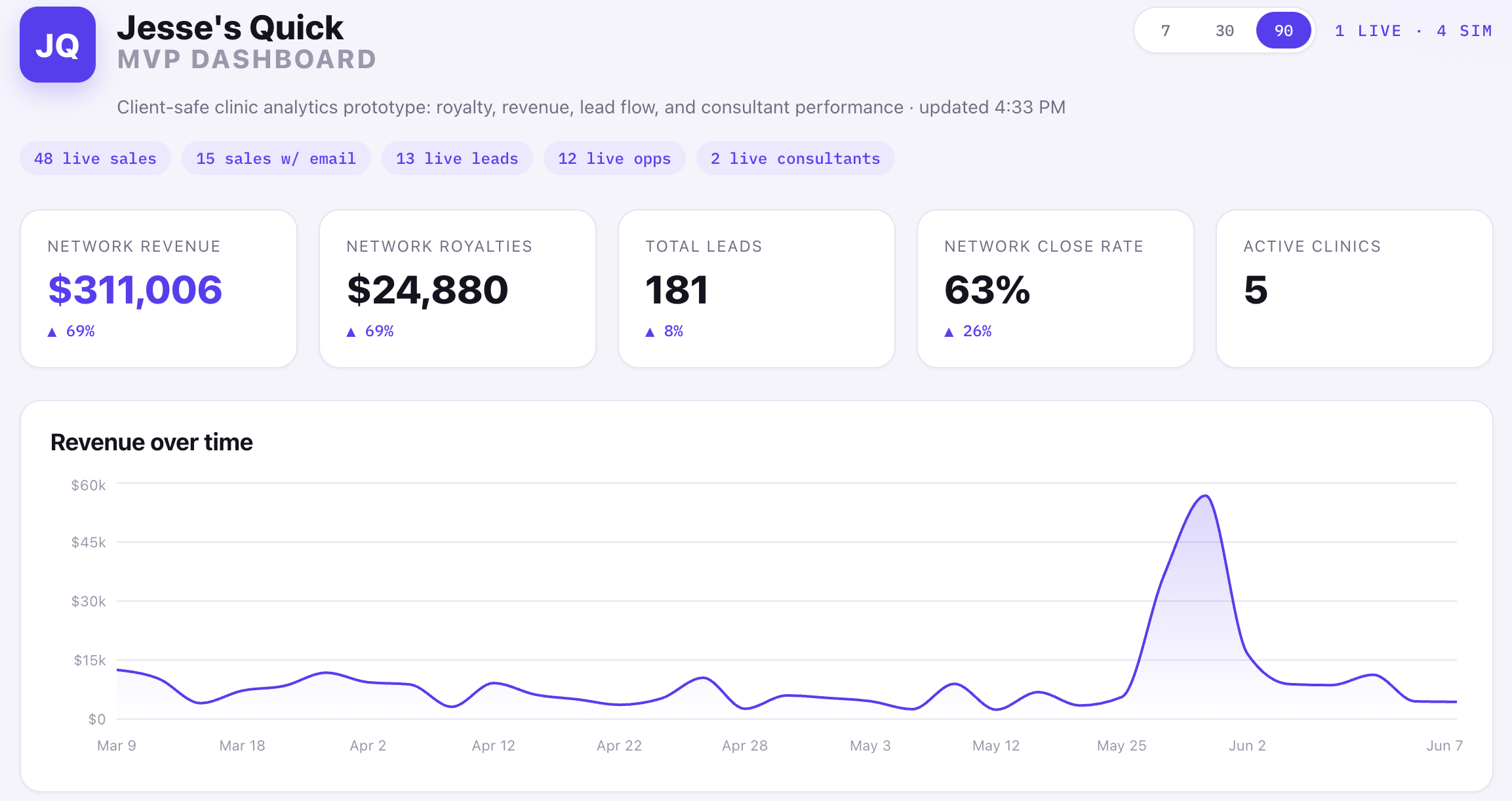
What I built
I built a clinic analytics prototype with no proprietary data and no private business information, just a small slice of a real project I worked on.
The challenge was simple: what happens when a clinic network has revenue in Square, customer activity in GoHighLevel, and leadership wants one clear view without digging through spreadsheets?
The goal was to build a rough but working MVP in one evening. Not a fake Dribbble dashboard, but a real data pipeline with enough live API behavior to prove the hard parts and create a foundation to build on.
It was one evening, my wits, AI tools, and a real operational problem. Basically a hackathon from my college days, except this time the issue was real and I was not surviving on vending machine dinner.
A lot of the work over my past two roles has involved turning bespoke data points into meaningful, actionable insights. That is probably why these problems are fun to me. The raw data is usually messy, scattered, and weirdly specific, but somewhere inside it is a business question waiting to be made obvious.
The problem
The dashboard had to reconcile two systems that do not naturally agree with each other.
Square knows payments. GoHighLevel knows contacts, opportunities, sources, and consultants. The useful business answer lives between them: which revenue came from which lead source, which consultant influenced it, and what royalty performance looks like across a clinic network.
The hard part was not drawing charts. The hard part was making sure the numbers were not just plausible-looking nonsense.
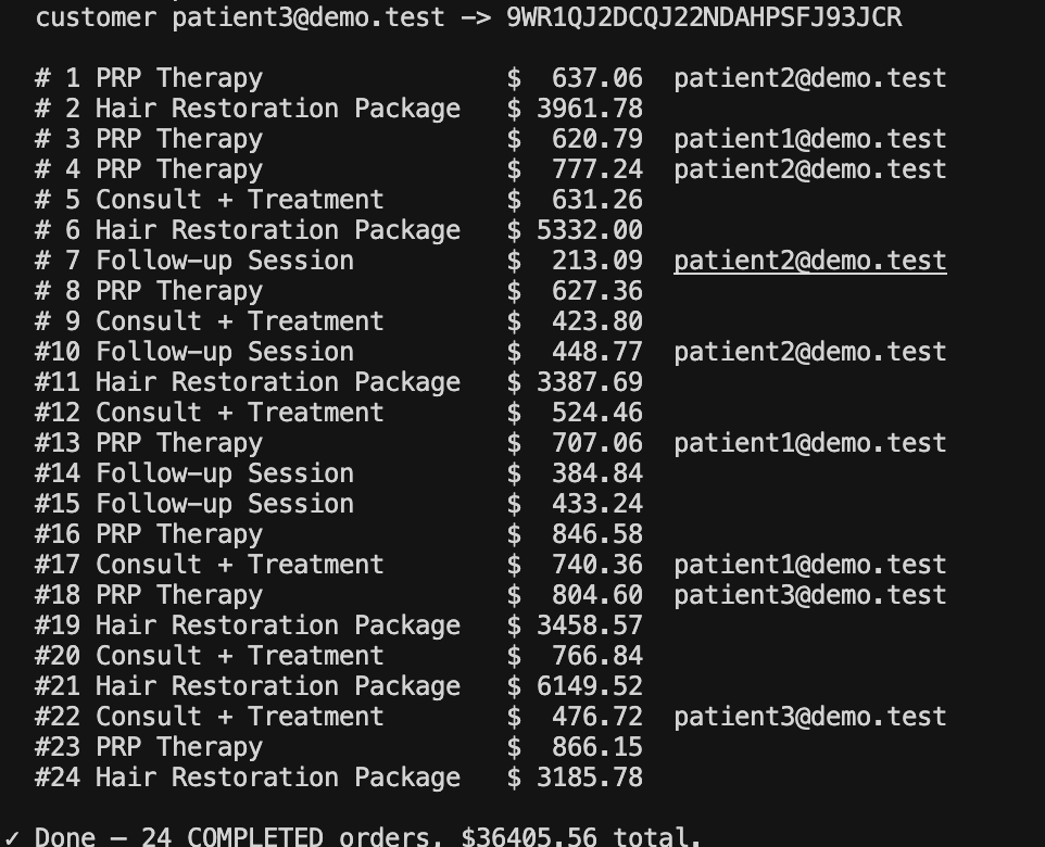
The join
The cross-system join used customer email.
Square order -> Square customer email -> GoHighLevel contact -> GoHighLevel opportunity -> assigned consultant
That sounds tidy until you learn Square orders often give you a customer ID, not the email directly. So the pipeline had to hydrate the customer record before the sale could be matched to a CRM contact. Without that step, revenue existed, opportunities existed, consultants existed, and the dashboard still could not attribute the money correctly. Very cool, very rude, no me gusta.
Consultant attribution
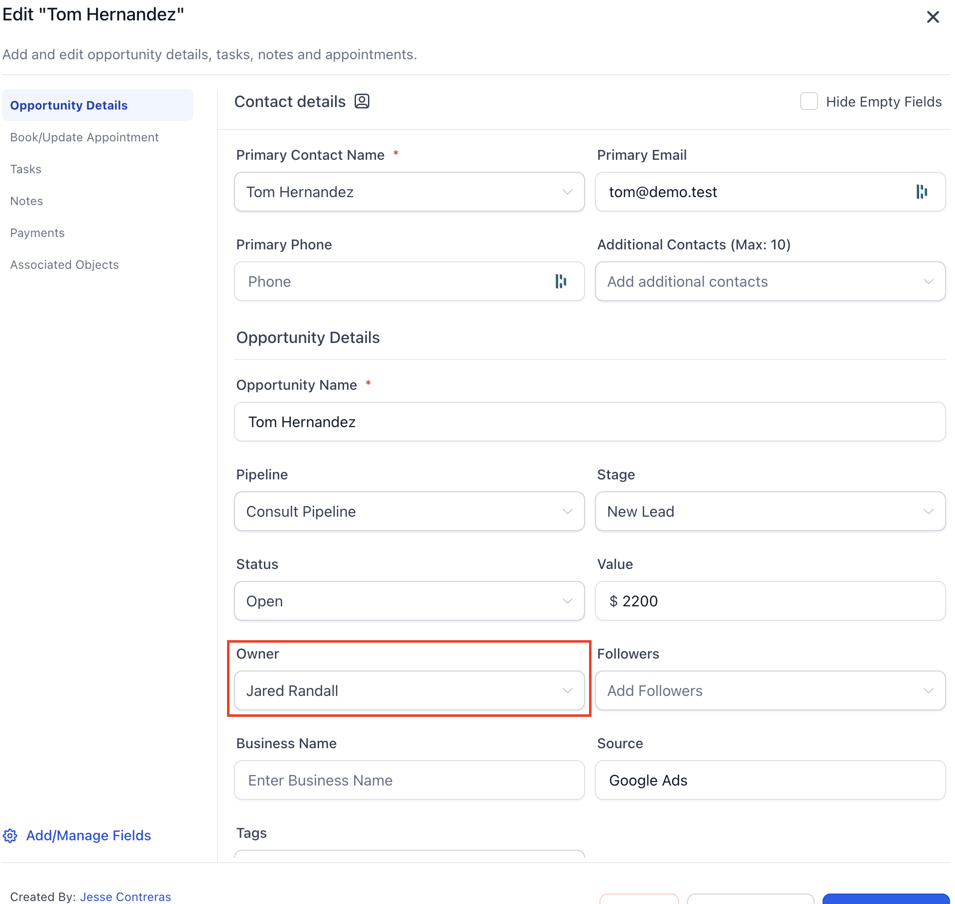
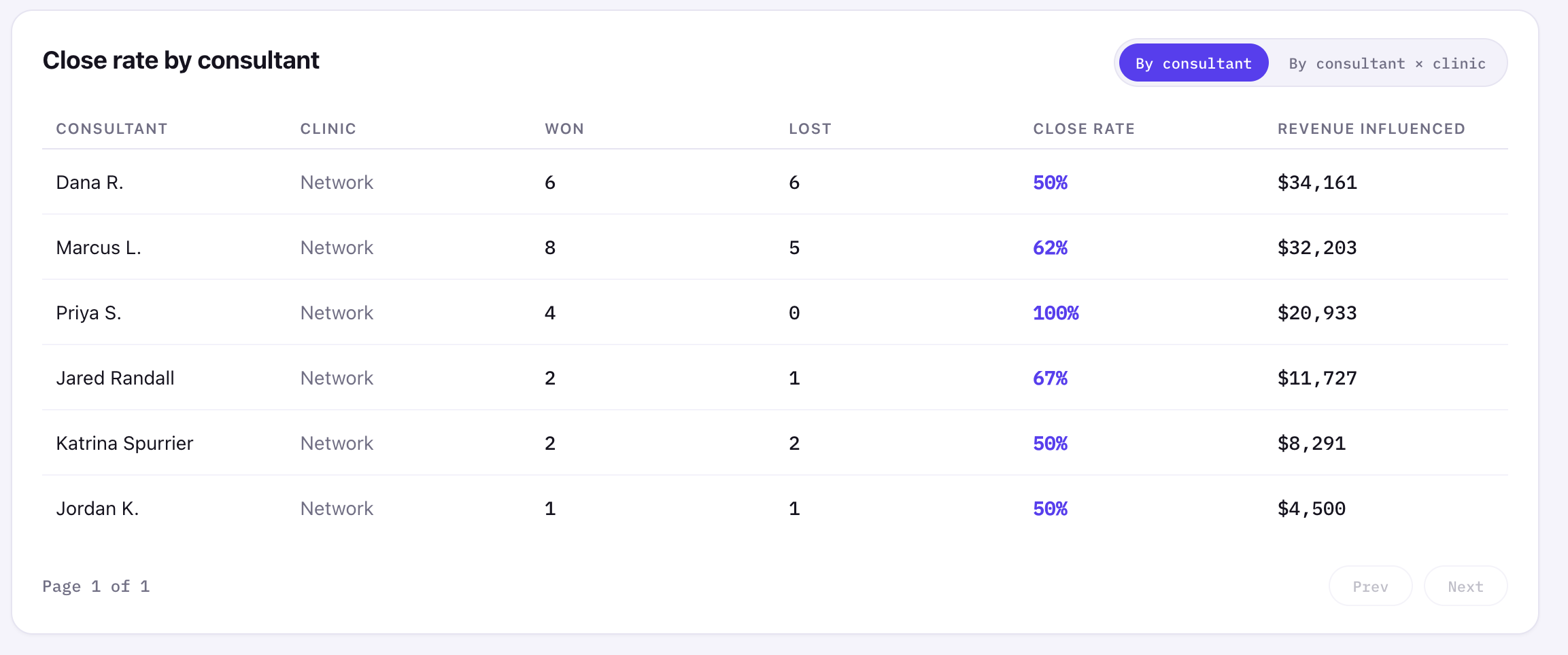
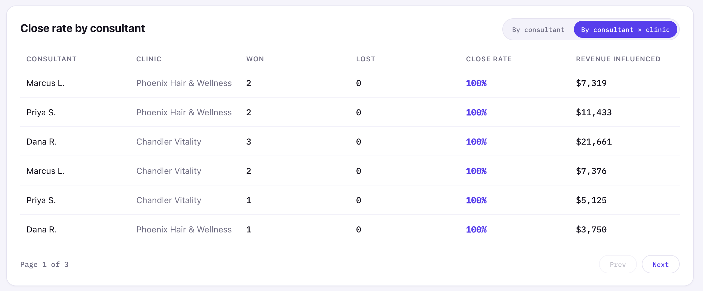
For consultant performance, I attributed revenue through the opportunity owner, not the contact owner. That matters because contact ownership is often empty or inconsistent, while opportunity ownership is closer to the actual sales motion.
The dashboard supports both a network-level consultant rollup and a consultant-by-clinic view. The detailed view is paginated so the card does not explode vertically every time the toggle changes. Small UI decision, big "this doesn't feel broken" energy.
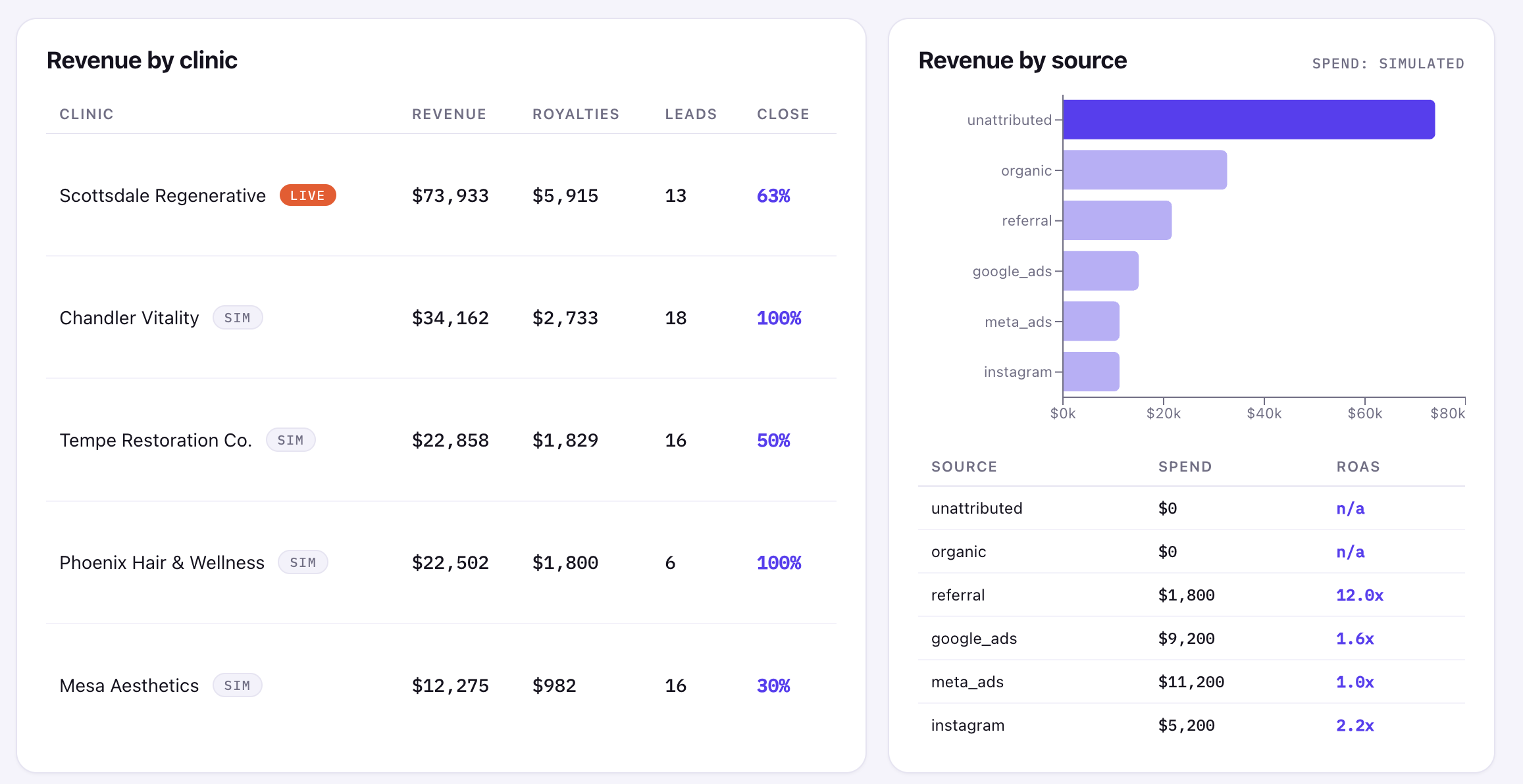
Revenue sources and simplifying the mess
The source chart intentionally shows unattributed and organic as separate buckets in the demo because I wanted to expose what the raw source model was doing.
In production, I would probably merge or simplify those categories depending on how the business actually uses them. Organic usually means "we know this was not paid/referral." Unattributed usually means "the source is missing or the join could not prove it." Those are technically different, but too many technical buckets can turn a dashboard into noise.
Sometimes the right analytics decision is not "show every distinction the database can express." It is "show the distinction a human can act on." If leadership cannot make a different decision from two separate buckets, those buckets may not deserve separate visual weight.
Charting choice
I used Recharts, an open-source React charting library, instead of Highcharts, which I had more experience with. Highcharts is polished and mature, but it brings commercial licensing considerations and a more imperative integration model.
Recharts fit this project better because it is MIT licensed, React-native, lightweight enough for the chart types I needed, and easy to theme with the existing design tokens.
For an MVP, that trade made sense: fewer licensing questions, less integration weight, and enough charting power for revenue over time, revenue by clinic, revenue by source, and consultant performance.
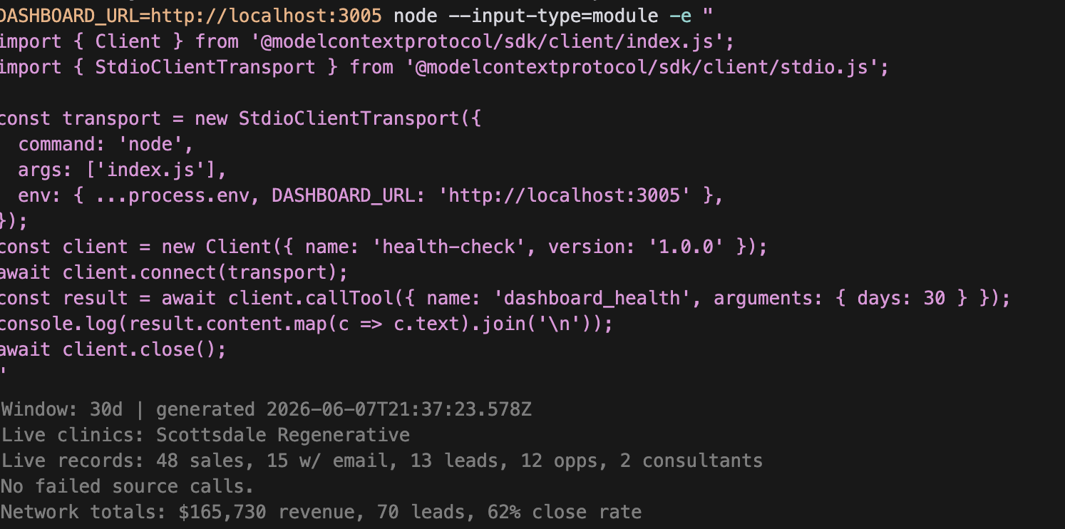
The MCP piece
The best part of the build was dashboard-doctor, a tiny MCP server that let Claude/Codex inspect the running app instead of asking me for screenshots.
It exposed two tools: dashboard_health, which reports live vs simulated state, record counts, source failures, and network totals, and reconcile, which checks whether the Square and GoHighLevel join is actually attributing revenue.
That mattered because the dashboard could look fine while the live pipeline was broken. Mock data can hide a lot. The MCP made the agent check the app's own /api/metrics output and verify whether live sales had emails, whether those emails matched CRM contacts, and whether consultants had non-zero influenced revenue.
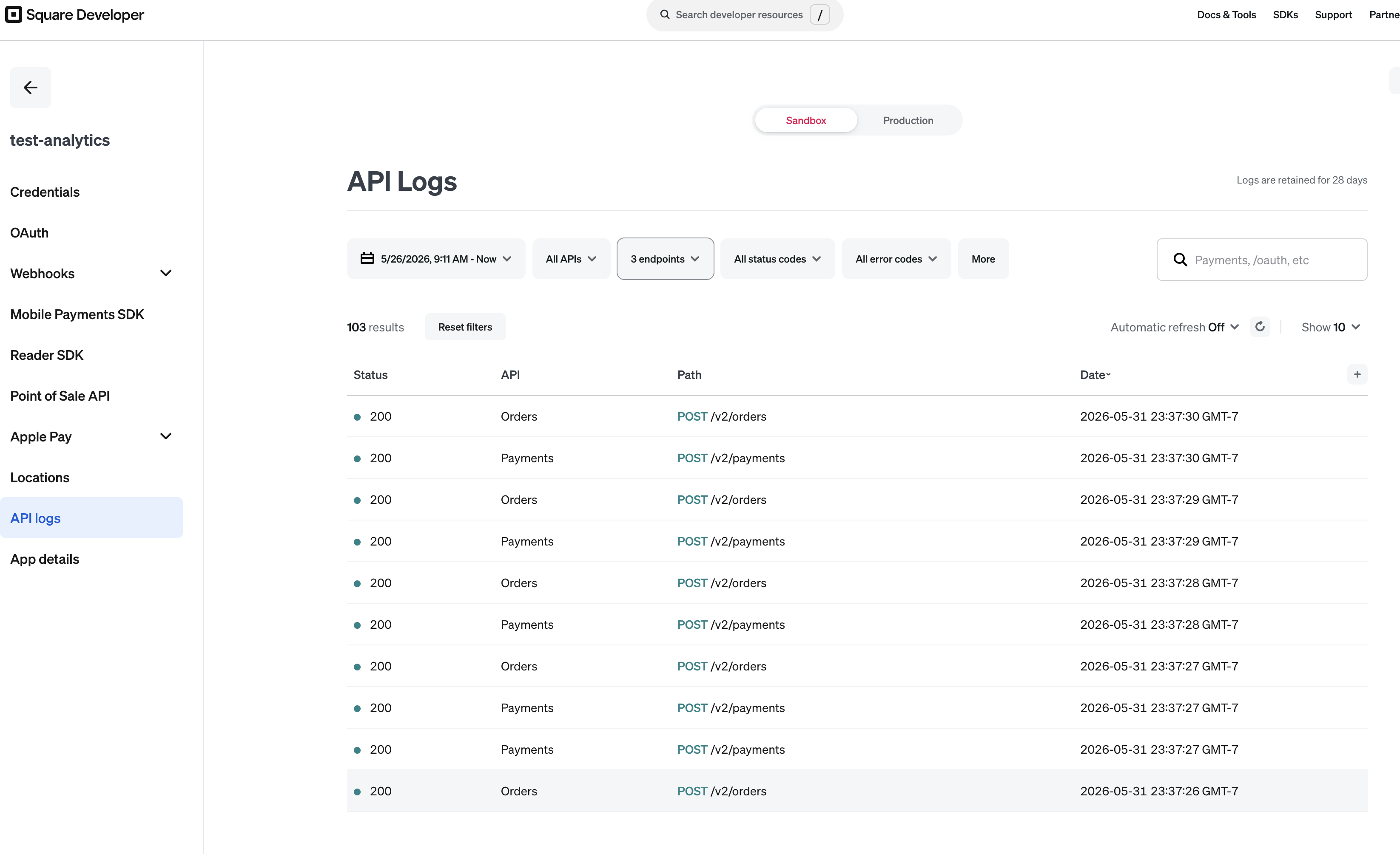
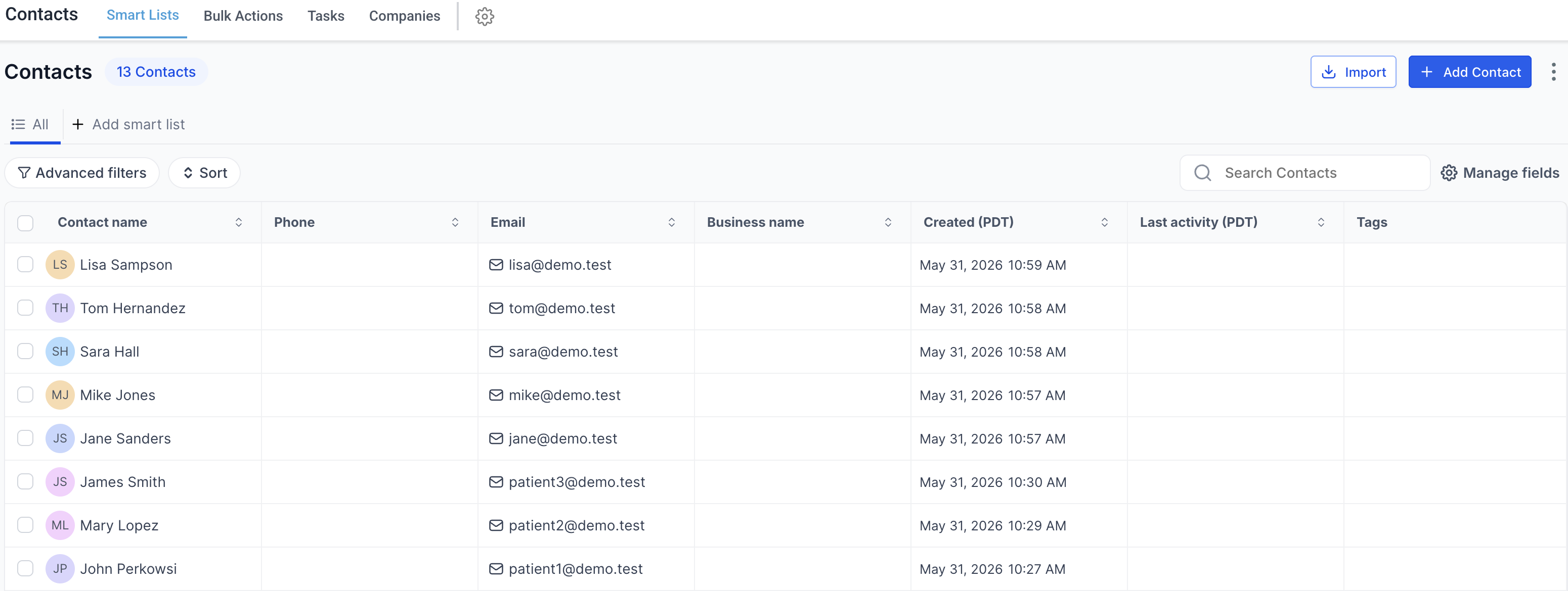
Demo access and stale data
This was built as a time-boxed demo using sandbox and trial access, including live GoHighLevel API data while that paid access was still available. If the CRM side is stale or no longer responds, that is because keeping the GoHighLevel account active for this demo would have cost about $300/month, which was not worth paying after the prototype had already proven the integration path. The project is meant to demonstrate the architecture, reconciliation logic, and dashboard behavior, not maintain a permanently funded third-party CRM environment.
AI workflow and cost discipline
I used AI coding tools heavily, but I did not want to give them unlimited room to wander. That is where plan mode, task-by-task implementation, verification, and post-change auditing mattered.
Agentic coding can burn real money if you let it drift: giant context windows, repeated tool calls, broad rewrites, and "just one more pass" loops add up quickly. Recent reporting has made the same point at enterprise scale: companies are starting to care a lot more about token budgets, usage caps, and governance after seeing how expensive unchecked AI workflows can become. Inc. covered one extreme version of that problem here.
The lesson for me was simple: AI is most useful when it has constraints. Give it a plan, make it verify, and make the system observable. Otherwise, you are not getting engineering leverage; you are just paying for a powerful tool to generate more work than it resolves.
What I would change for production
For production, I would not rely on email alone as the identity strategy.
Email is a useful starting point, but real customers mistype emails, share emails, use different emails across systems, or skip email entirely. The production version should resolve customers to a stable internal ID using multiple signals: email, phone, name, visit date, and possibly fuzzy matching where exact matching fails.
I would also move ingestion from on-demand API reads to scheduled sync jobs with incremental updates, retries, token refresh handling, and persisted snapshots. The marketing spend layer would connect to Google Ads and Meta instead of using simulated values. The current ROAS scaffold is useful because it shows where the feature belongs, but it is clearly labeled as simulated because fake certainty is worse than no metric.
Closing
This project was not about making a dashboard that merely looked finished. It was about making two unrelated systems tell one coherent story: revenue from Square, customer and opportunity context from GoHighLevel, attribution through consultants, and royalty performance across a clinic-style network.
The bigger lesson is that dashboards are dangerous when they only look correct. The numbers need provenance. The joins need verification. And if AI is helping build the thing, it needs guardrails too.